How does Plume work for Doctors?
Whe a Parkinson's patient uses Plume, doctors can view 5 key data points,
bar_chart
Health Metrics
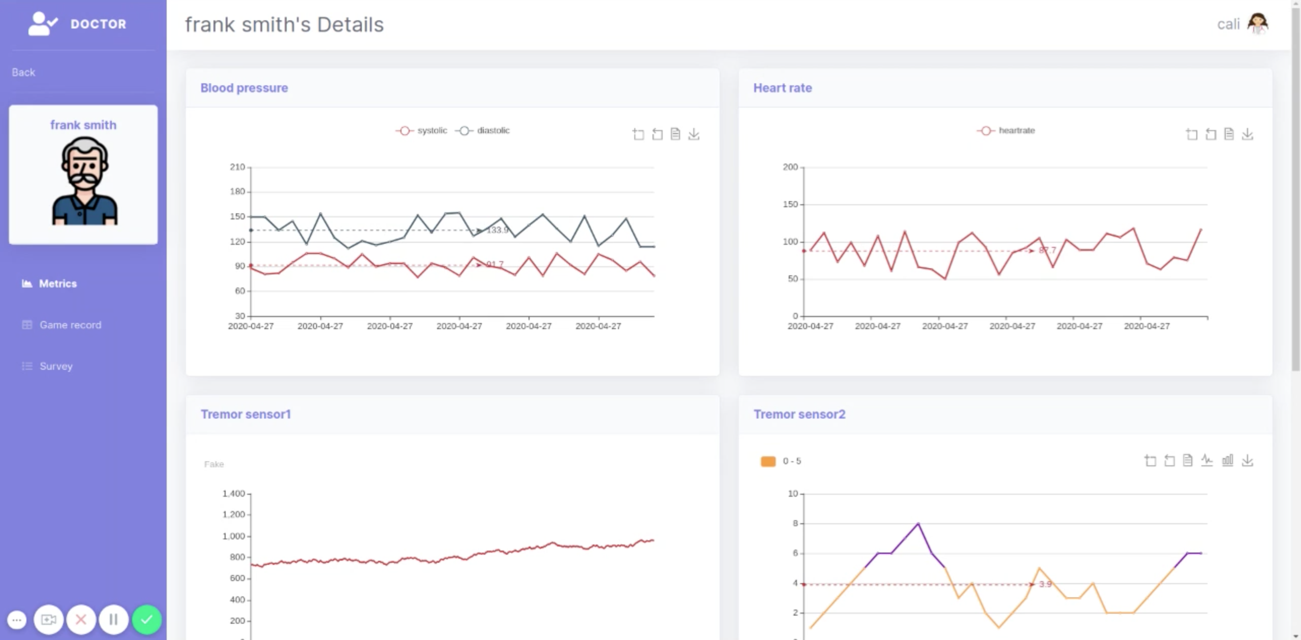
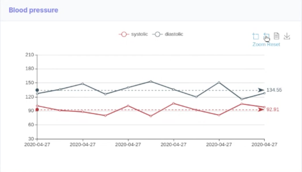
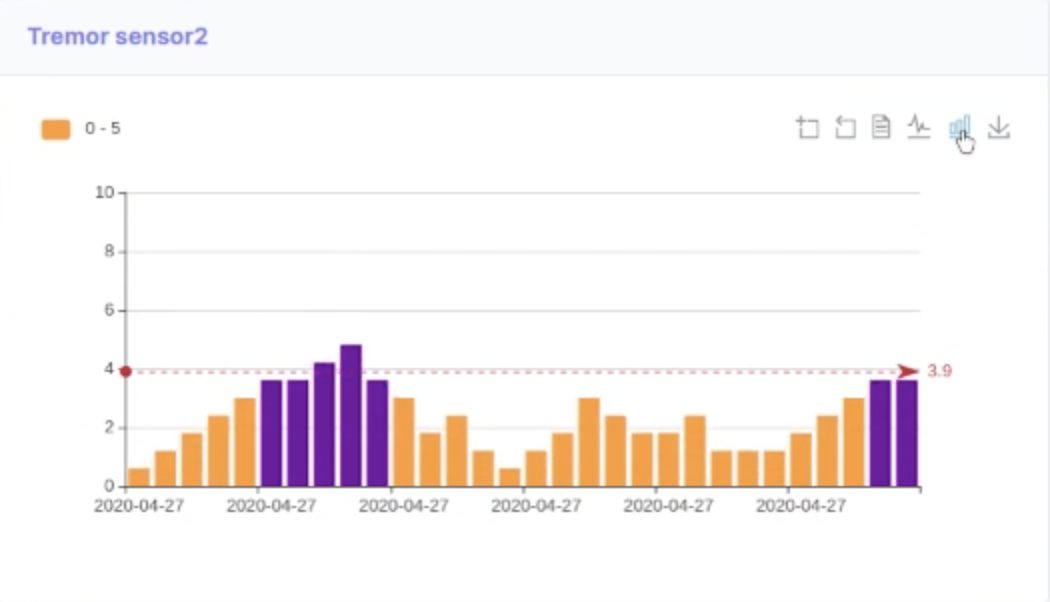
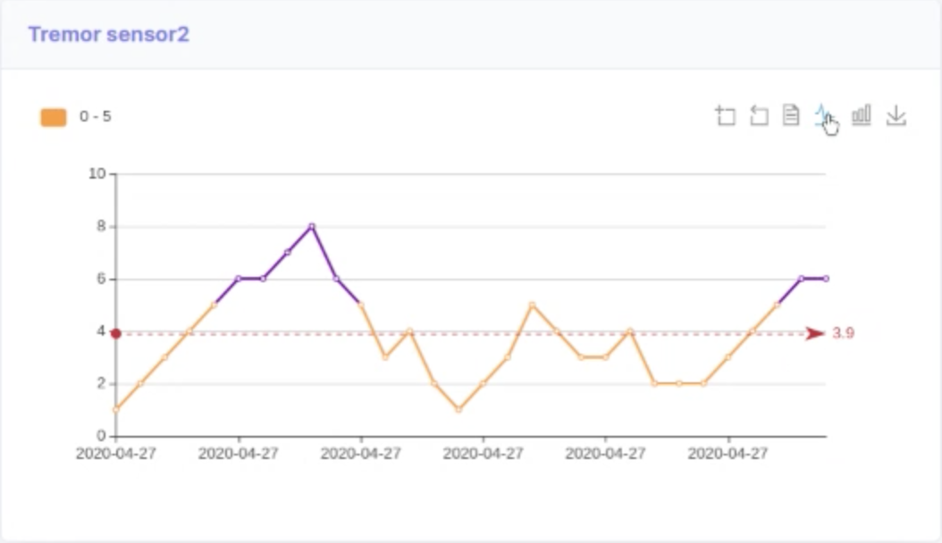
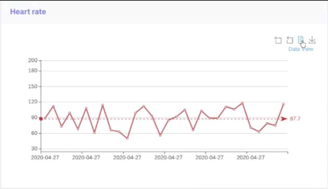
Doctors are able to view detailed health metrics of patients, including heart rate, blood pressure, tremor frequency and more, in real time.
calendar_today
Calendar
Doctors are able to coordinate their schedule with their patients in one central area.
question_answer
Survey
Doctors are able to customize survey questions sent to their patients routinely, so that they are able to track their patients health in between routine checkups.
Dashboards for Doctors
Due to Parkinson’s Disease chronic nature and unique symptom manifestation in each patient it’s important to allow doctors and caregivers visibility into symptom development overtime. Plume provides a comprehensive set of dashboards for not only patients, but primary caregivers and doctors as well.
How do I get started? expand_more
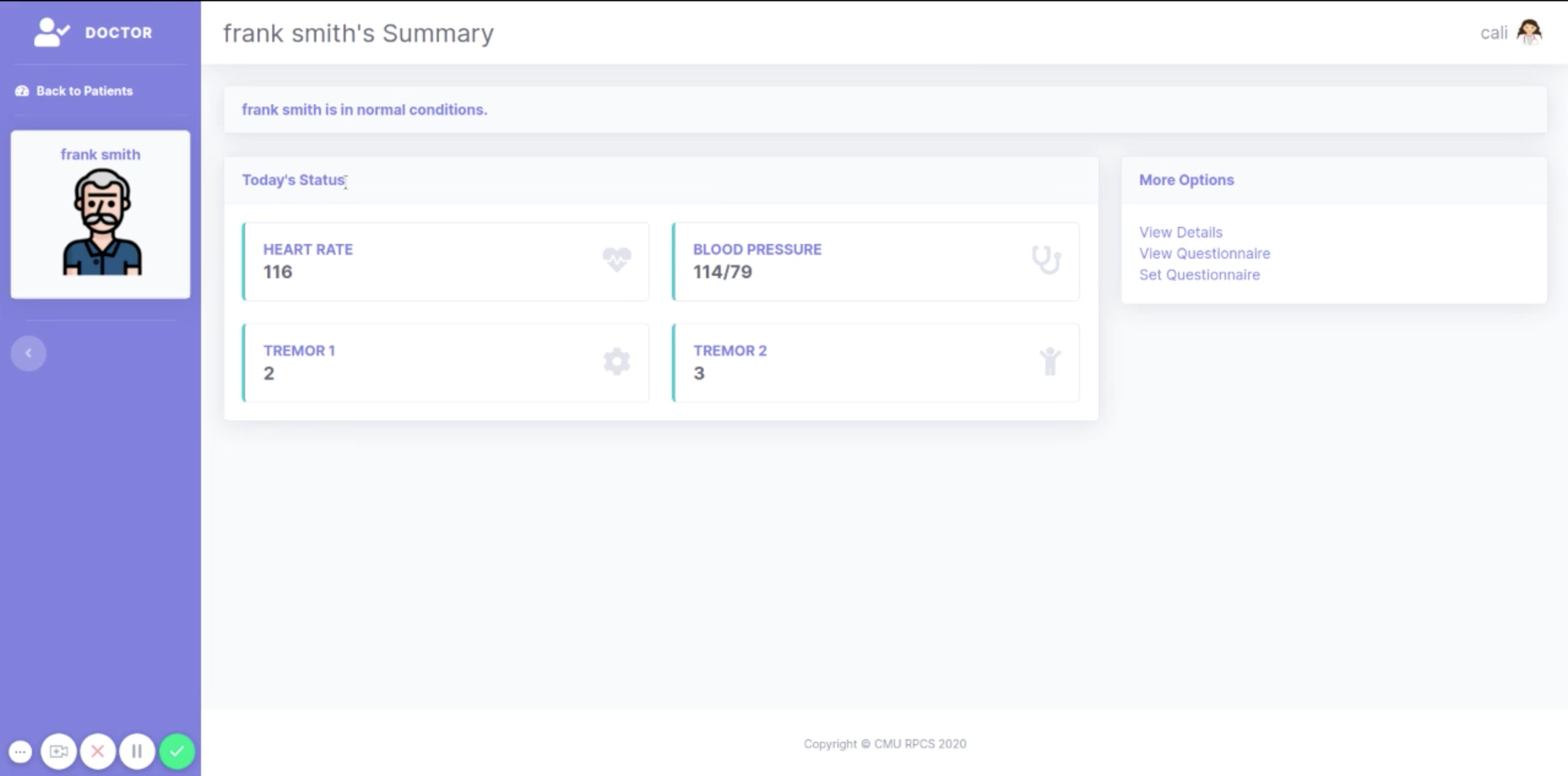
View a Patient’s Information
View Basic Information
Locate the desired patient on your Patients page
Click on the desired patient’s name.
If a patient is at any amount of risk, a banner near the top of the screen will display: “Alert: ,” followed by an explanation of the current risk.
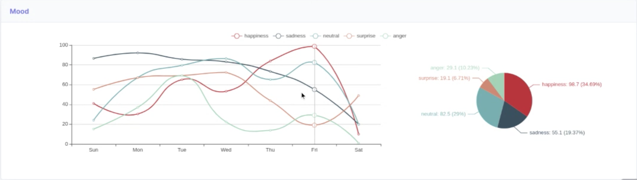
Refer to data visualizations on the page to review Important Metrics and Basic Health Stats.
View additional information from either visualization by hovering over data points of interest.
View Detailed Information
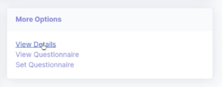
At the bottom right, in the “More Options” card, click “View Details.”
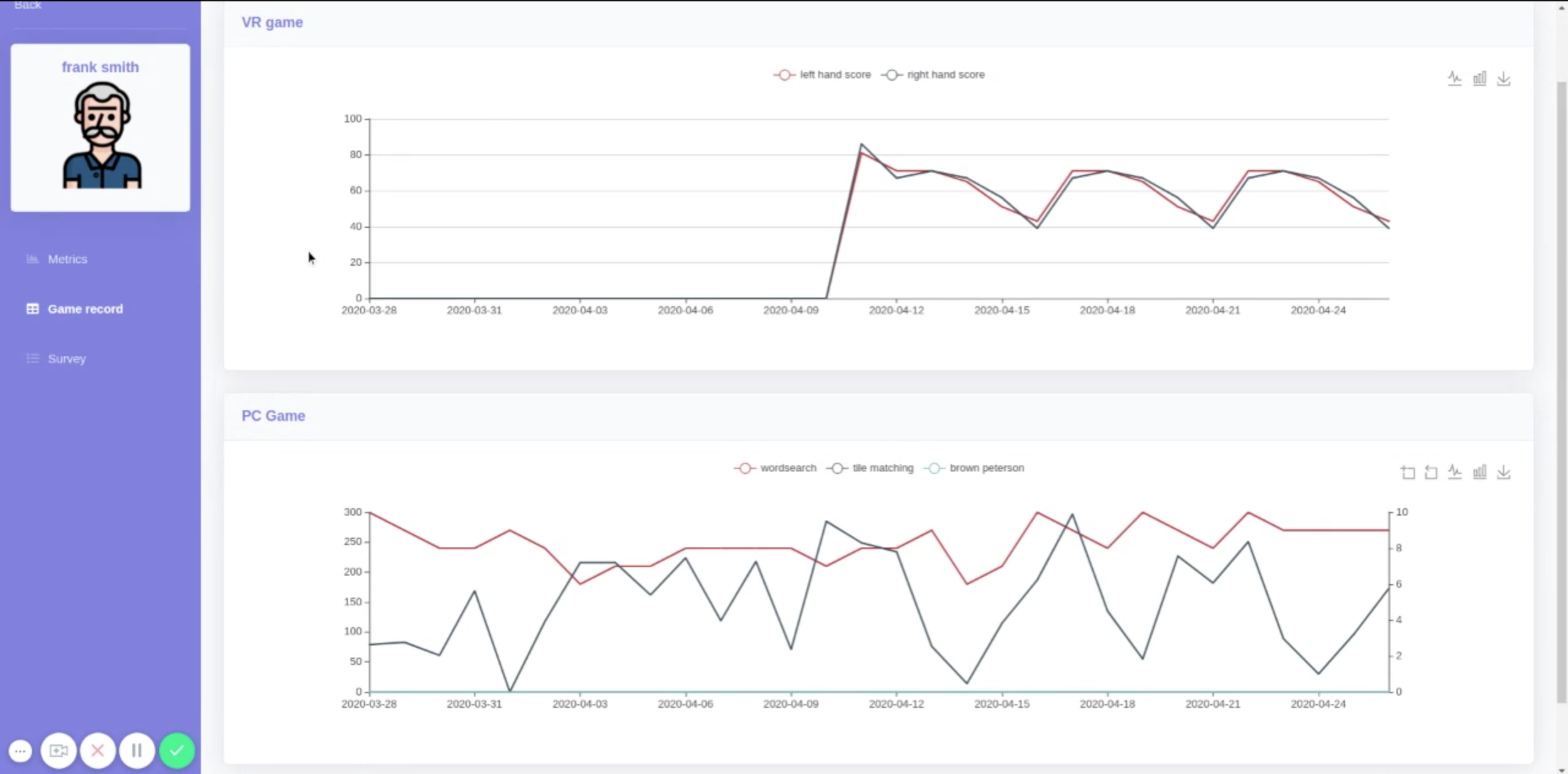
Click through the purple bar on the left to see the patient’s health metrics, game record or survey results.
Change Graph Type
Some metrics and game records may be viewed through a variety of different graphs. Instructions to change to each possible type of graph are listed here.
Save a Graph
On the Metrics or Game Record page, find the graph that you wish to save.
Towards the top right of the graph, click the “Save as Image” icon, shaped like a downward-pointing arrow
In the window that appears, click “Save”
Change to Bar Chart
Above and to the right of the graph, locate and click on the “Switch to Bar Chart” icon, shaped like three vertical rectangles above a horizontal line.
Change to Line Chart
Above and to the right of the graph, locate and click on the “Switch to Line Chart” icon, shaped like a jagged line above a horizontal line.
Change to Data View
Above and to the right of the graph, locate and click on the “Data View” icon, shaped like a lined piece of paper.
Toggle Displayed data points
Some graphs show multiple kinds of data. You can choose to show or hide different data points.
Above the graph, locate the names of the different kinds of data, each of which is displayed next to an icon that looks like a white circle over a horizontal line.
Click on the name or icon. If that data is currently being displayed, clicking on it will hide it. If it is currently hidden, clicking on it will cause it to reappear.
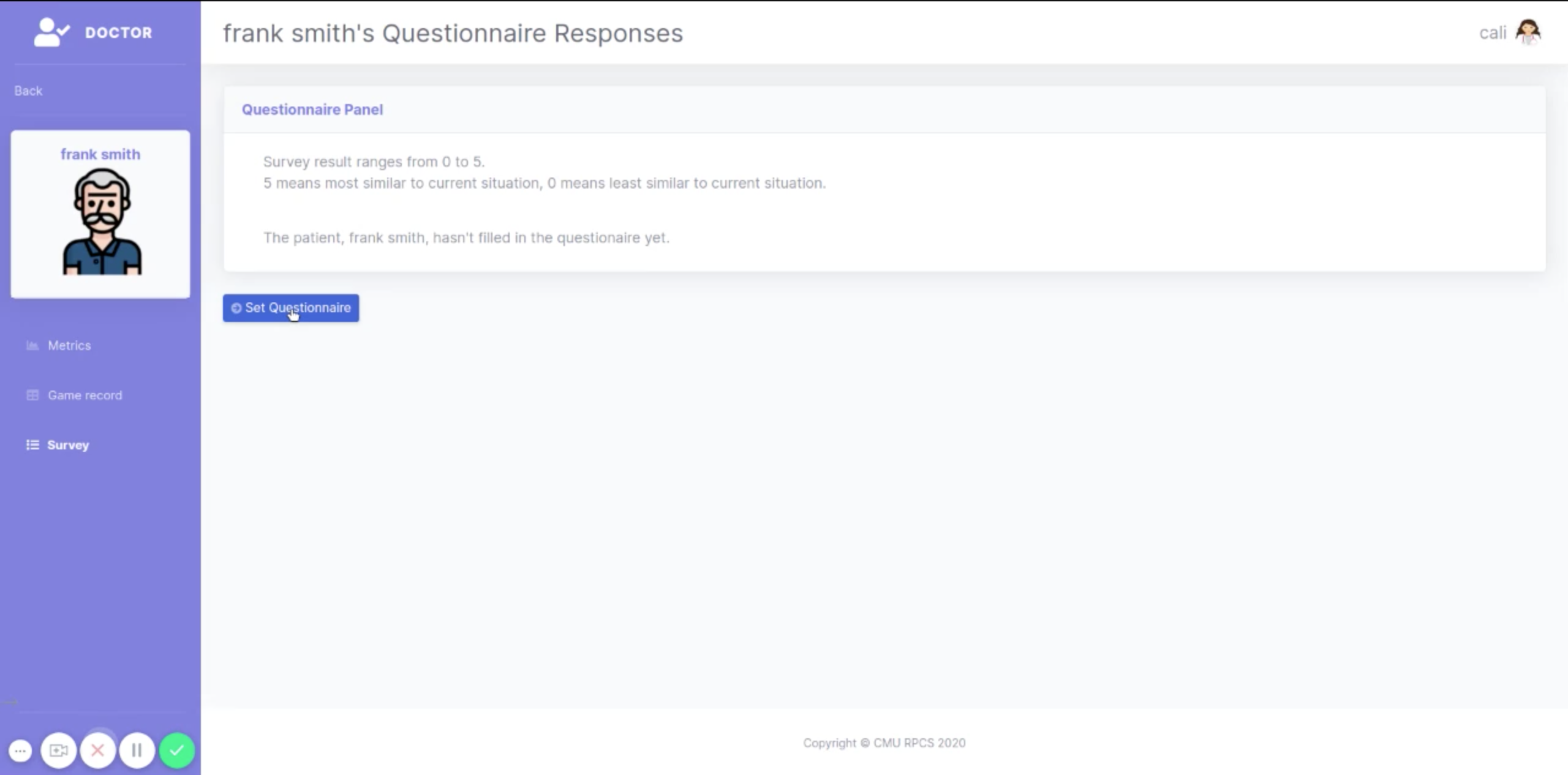
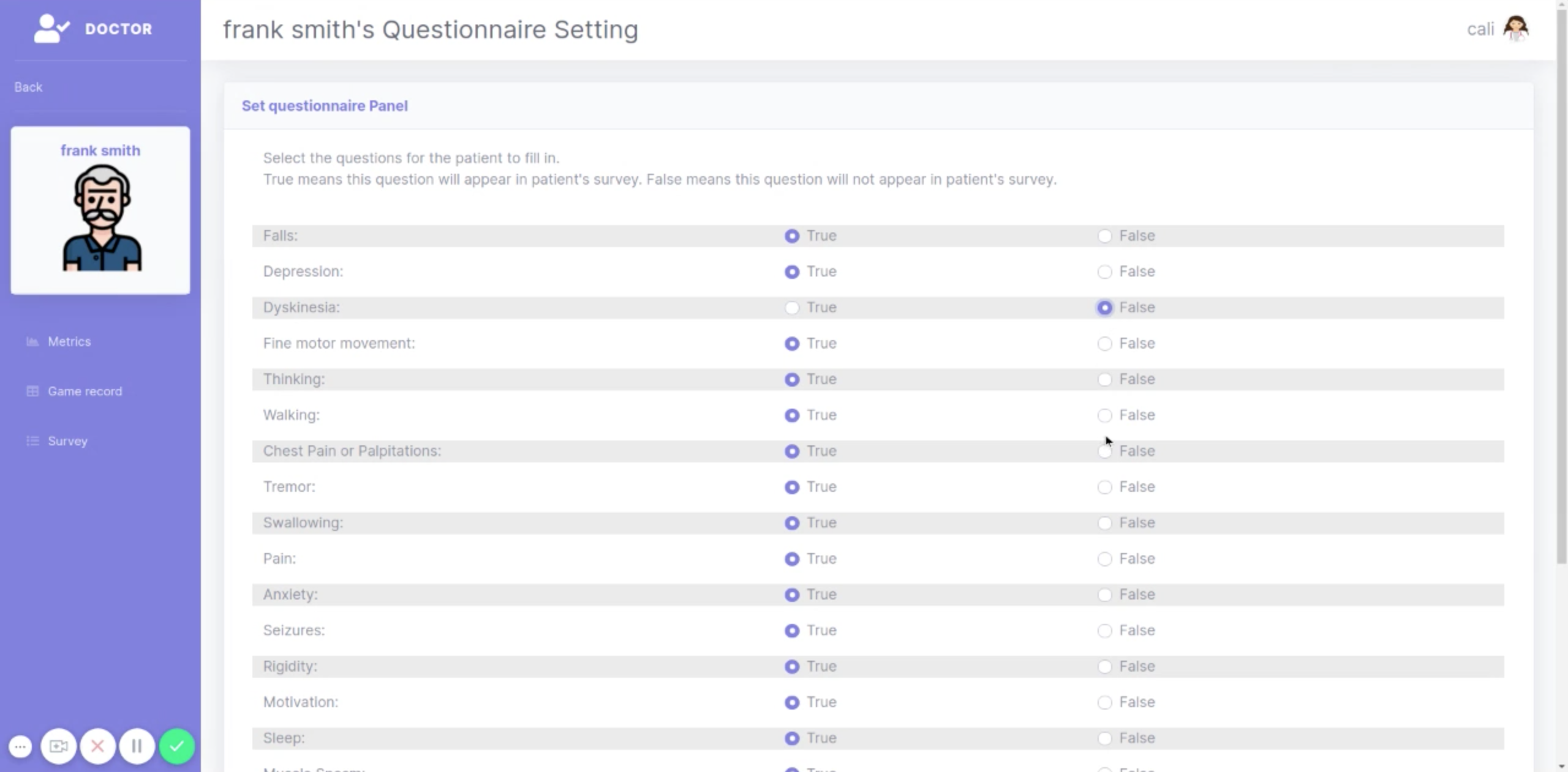
Set Questionnaire Items
To reach the Set Questionnaire page
From the landing page for this patient
At the bottom right, in the “More Options” card, click “Set Questionnaire.”
From the Survey Page
At the bottom left of the survey responses, click the purple “Set Questionnaire” button

Create questionnaire
Step 1
At the bottom right, in the “More Options” card, click “Set Questionnaire.”
Step 2
When you are done, click the purple “Submit setting for” button at the bottom of the panel.
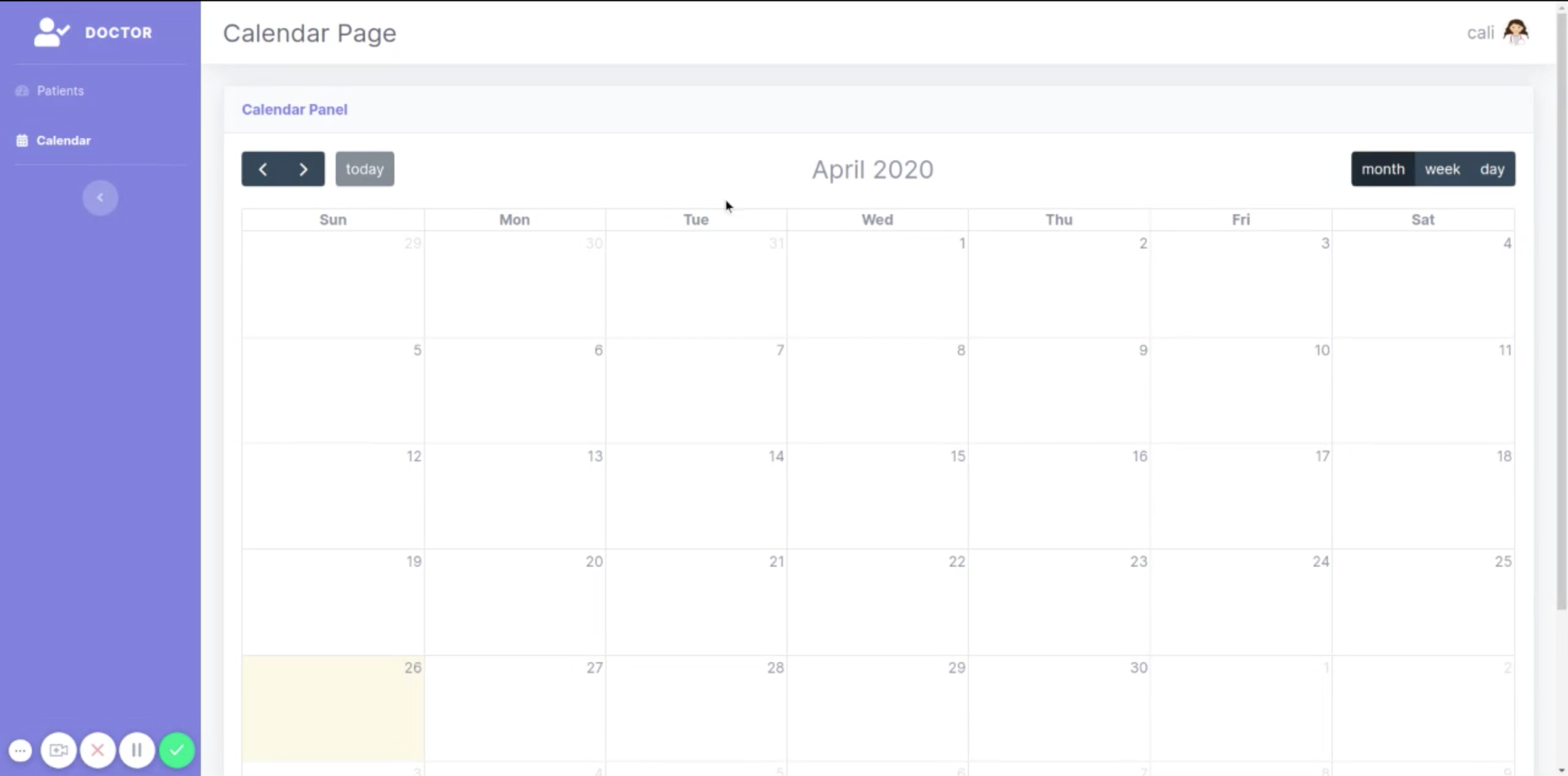
View your Calendar
Step 1
On the left side of the screen, in the purple vertical bar, click “Calendar”
You can view your calendar for the day, week, or this month by toggling through the buttons located at the top right corner of the screen.
You can also view other days, weeks, or months by clicking through the arrows at the top left corner.
Return to today by clicking the “today” button at the top left of the calendar.
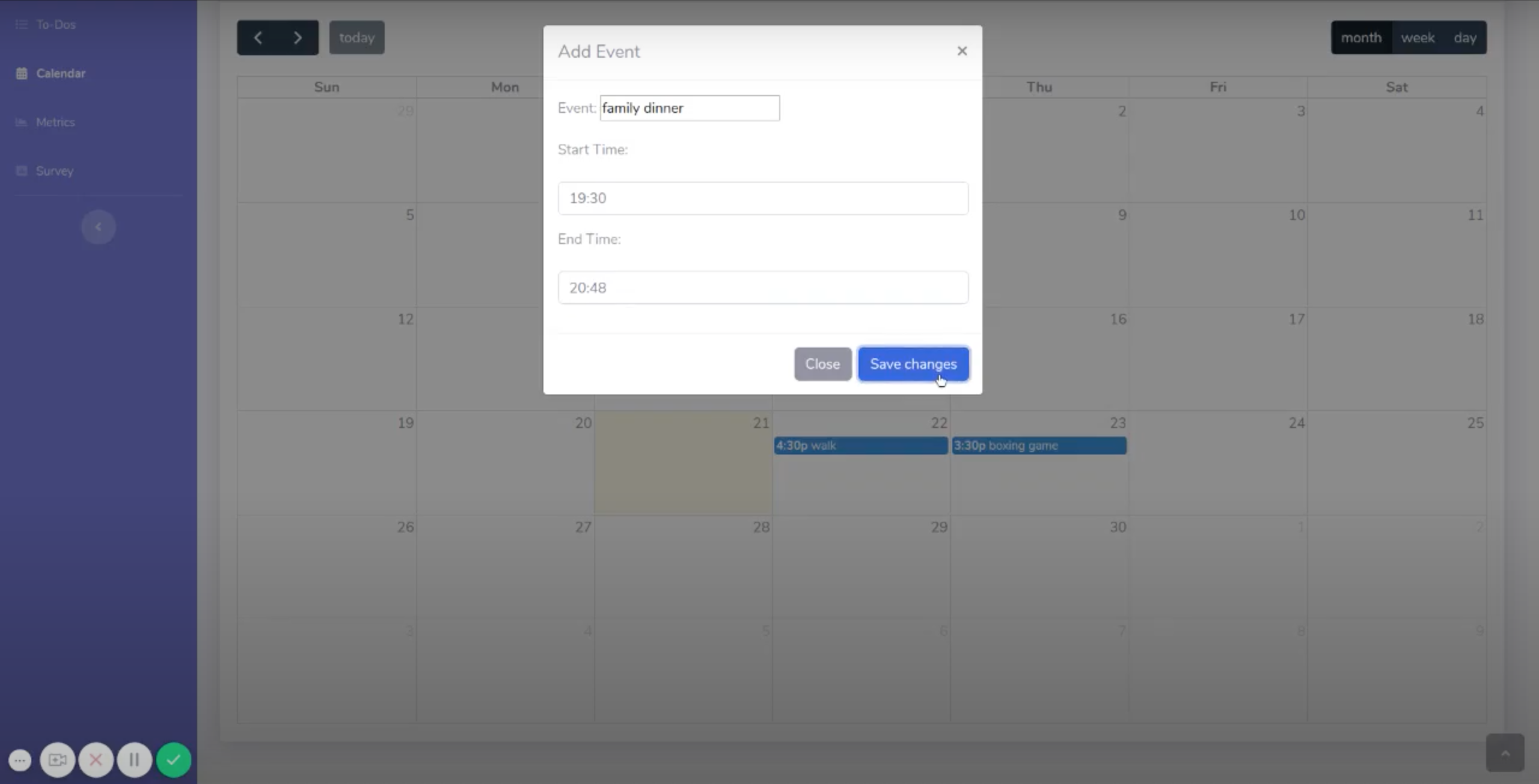
Set a Calendar Event
Step 1
Click on the day that you want to create your calendar event.
Set the event name, start time, and end time as prompted on the screen. Note that this uses a 24-hour clock.
Click on “Save Changes” to save this event.